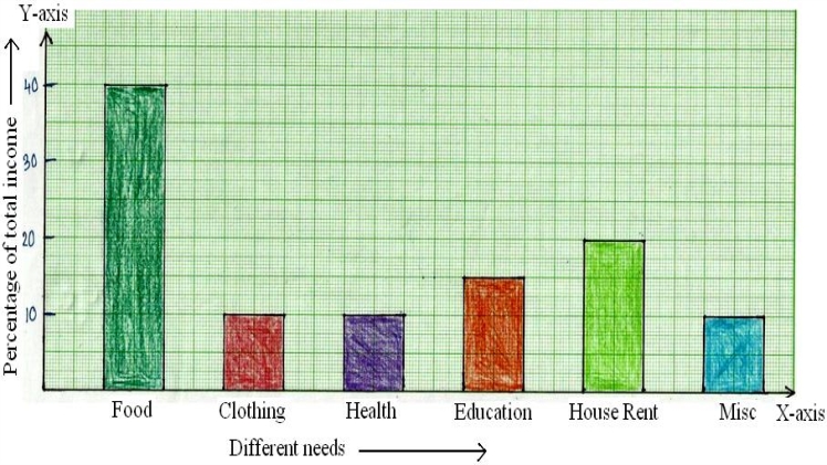
A bar chart is a statistical tool, used to represent the given set of data via horizontal or vertical rectangular bars on either axes- x-axis or y-axis with the height equal to the given values. Let’s know more about the bar chart by going through the given article.
How to draw a bar chart?
The construction of a bar chart can be understood with the help of an example. XYZ is a firm that earned different amounts of profits in different years such as the amount of profit in the year 2017 was Rs. 2,00,000, in 2018 was Rs 3,00,000, in 2019 was Rs 4,00,000, in 2020 was Rs. 5,00,000. The firm wants to display the data through a bar chart so that it becomes easy to understand in which year the firm earned maximum profit.
To draw the bar chart, follow the below-mentioned steps:
Step 1: Take a graph paper and think of the most suitable title for the bar chart such as “Profits earned in different years.”
Step 2: Now draw both the axes, horizontal axis (x-axis) and vertical axis (y-axis) on the plane.
Step 3: It is the time to provide a suitable label to the horizontal axis (x-axis) such as “Different years” and to the vertical axis (y-axis) such as “Amount of profits earned in rupees”.
Step 4: After providing labels, now mention the different years such as 2017, 2018, 2019, and 2020 and remember to leave an equal space between each year on the horizontal axis.
Step 5: Now determine the range of scale on the vertical axis for the values given in the data set such as 2,00,000, 3,00,000, 4,00,000, and 5,00,000. You can take the scale range of 1,00,000.
Step 6: Now draw the vertical rectangular bars on the horizontal axis specifying each year. Remember to draw each bar with equal gaps on the horizontal axis and the height of the bars should be equal to the measure of given values.
Step 7: This is the last but most important step. Now that the bar chart is drawn, you can easily observe it and find out the year in which maximum profit was earned.
What are the uses of the bar chart?
- To compare the summarized data: The most common use of a bar chart is to compare the summarized data. You can represent the category of the given data on the horizontal axis and measures of given values on the vertical axis. By drawing the rectangular bars on the x-axis with height equal to the given values you can compare the data.
- For illustrating the subcategories of data: Sometimes data needs to be elaborated more by representing the subcategories of the data. Bar chart allows you to display the categories along with the subcategories of the given data set.
- For displaying time-based data set: Bar chart also allows one to represent the time-based data so that it can be easily observed and required results can be evaluated.
- To know the overview of given data: A bar chart is the best option in case you want to make an overview of the numerous collected data that are all under main categories.
- Provides an easy and quick description of data: Sometimes the description of the given categories of the data may be lengthy. In such a case you can use a double horizontal bar chart.
Bottom Line:
Cuemath is the education company that imparts the after-school Math program to the student in ways that are easy to understand. If you have any doubts related to the bar chart or line graph then you can access the online classes of Cuemath at a reasonable fee structure.

