How to Build a Clear First Screen for Any Website

By Mohammad Manir in Technology
Key Takeaways
- The first screen should quickly explain the offer, intended audience, and next step.
- Specific, plain-language copy is more useful than a clever but unclear slogan.
- Visuals, proof, and calls to action should all reinforce one central message.
- Mobile behavior, loading speed, and accessibility need to be planned from the beginning.
- Short tests with real people can reveal confusion before a page goes live.
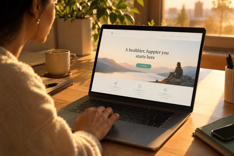
The first screen of a website is where visitors decide whether they understand the page well enough to continue. It does not need to tell the entire brand story. It needs to remove the most immediate questions: what is being offered, who is it for, and what should happen next. Reviewing hero section examples can be useful for spotting different layout patterns, but the goal is clarity rather than copying a visual trend.
A successful first screen directs attention in a logical order. Visitors should be able to notice the main promise, get enough context to judge its relevance, see a reason to trust it, and find an action that matches their level of interest. Every element should help make that decision easier.
1. What the First Screen Needs to Do
Start with one purpose. A service homepage may need to earn a consultation request, while a product page may need to move someone toward a trial or purchase. The first screen should make that purpose visible without overwhelming the visitor with every feature, audience segment, or company detail.
For example, “Better work starts here” sounds polished but leaves the offer unclear. “Project planning software for construction teams” gives a visitor immediate context. Specificity helps the right audience recognize themselves and helps everyone else decide whether to keep browsing.
2. Write a Message Visitors Can Grasp Quickly
Start With the Visitor’s Problem
Strong copy begins with the task, problem, or outcome the visitor cares about. Replace internal language such as “next-generation solutions” with words people would use when describing their own need. A clear headline can state the result, while supporting text explains how the offer delivers it.
Use a Simple Copy Structure
- Headline: State the main result or offer.
- Supporting text: Add one or two sentences of helpful context.
- Proof: Include a relevant review, credential, client type, or product detail.
- Action: Tell visitors what to do next.
Keep each line purposeful. Short sentences, familiar terms, and one central idea make the screen easier to scan. If a sentence does not help a visitor understand, trust, or act, it may belong farther down the page.
3. Choose a Layout That Supports the Message
Layout should follow the decision a visitor needs to make. A centered layout works well for a straightforward offer with one action. A two-column layout can balance explanatory copy with a product screen. Product-led designs work when seeing the interface answers important questions, while editorial layouts can suit portfolios, publications, and story-driven brands.
Whichever format you choose, establish a clear reading order. The headline should not compete with oversized navigation, decorative badges, or a busy background. A visually striking composition is only useful if visitors can still tell where to look first.
4. Use Visuals With a Clear Job
A visual should clarify the offer, not merely fill space. A software interface can show what a tool does. Photography can provide real-world context. An illustration may make an abstract service easier to understand, and a short demonstration can show a process that is difficult to explain in words.
Choose images that remain useful at smaller sizes, crop them deliberately, and write alternative text when the image communicates information. Avoid placing essential text inside an image. If the visual is purely decorative, it should stay quiet enough that the headline and action remain the focus.
5. Design a Strong Primary Action
The primary call to action should match visitor readiness. “Request a Quote” makes sense for a custom service, while “See How It Works” may be better for people still evaluating a product. An ecommerce page may lead with “Add to Cart,” and a nonprofit may lead with “Donate” or “Volunteer.”
Use a specific label, make the primary button visually distinct, and explain what happens after the click when the step requires commitment. A secondary action can help cautious visitors, such as “View Pricing” beside “Start Free Trial,” but it should receive less emphasis than the main path.
6. Plan for Mobile Visitors First
Mobile screens change content order, image cropping, navigation, and tap behavior. Check whether the headline remains readable, whether the main button is easy to tap, and whether the first screen becomes unnecessarily tall. In many cases, placing key copy before a large visual makes the offer easier to understand on a phone.
Test on real devices as well as browser previews. Check portrait and landscape orientations, enlarged text, slow connections, and fixed banners that might cover the primary action.
7. Protect Speed and Accessibility
Large hero images, video backgrounds, and unnecessary scripts can delay the moment when the main content appears. Compress media, reserve space for images to reduce layout shifts, and prioritize the content needed for the first screen. Guidance on how the largest visible content loads can help teams identify why an important headline or image appears late.
Accessibility is equally fundamental. Provide readable contrast, clear focus states, keyboard-accessible controls, logical headings, and reduced-motion support. The practical recommendations for designing accessible interfaces also emphasize that color alone should not communicate essential meaning.
8. Test the Page Before Launch
- Show the screen briefly and ask what the site offers.
- Ask visitors what they think they should do next.
- Test the page on different devices, browsers, and connection speeds.
- Review video with sound off and motion reduced.
- Navigate every interactive element with a keyboard.
- Use analytics after launch to review clicks, scroll behavior, and form starts.
Change one important element at a time when testing alternatives. That makes it easier to understand whether a different headline, visual, or action improved the page.
9. Common First-Screen Mistakes
- Using a vague headline that hides the offer.
- Giving several buttons equal visual weight.
- Using decorative media that adds no context.
- Putting important copy over a cluttered image.
- Starting with motion before explaining the page.
- Making text too small or contrast too weak to read comfortably.
- Copying a popular layout without considering the audience or goal.
10. A Practical Launch Checklist
- Can a new visitor describe the offer in one sentence?
- Is the intended audience clear?
- Does the visual reinforce the message?
- Is there one obvious primary action?
- Does the screen work well on a small phone?
- Are contrast, keyboard access, and motion preferences addressed?
- Has someone outside the project tried the page?
11. Frequently Asked Questions
What should appear on the first screen of a website?
Most first screens need a clear headline, brief supporting copy, relevant proof or a useful visual, and one primary action. The exact combination depends on the page goal.
How many calls to action should a first screen have?
One primary action is usually enough. A quieter secondary option can help visitors who need more information before taking the main step.
Is animation necessary?
No. Motion can demonstrate a process or provide feedback, but it should never delay the message or prevent people from using the page comfortably.
Conclusion
A clear first screen is not defined by a particular style. It is defined by how easily visitors can understand the offer and move forward. Focus the message, give visuals a purpose, make one action obvious, and test the result with real people. Removing confusion is often the most valuable design improvement.