
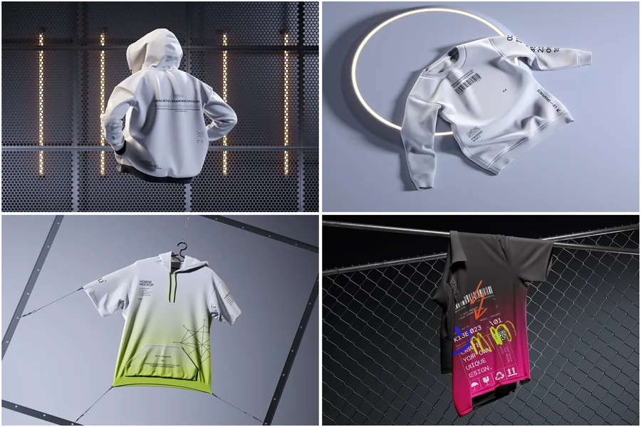

A shopper can’t touch the cotton, tug the hem or hold a hoodie up to the mirror. All they have is your gallery. That makes the product image the closest thing to a fitting room an online store owns, and it is why choosing a mockup is a sales decision, not a decorative one.
An apparel mockup is a ready-made photo or render of a blank garment onto which your design is placed digitally. Done well, it is indistinguishable from a studio shot; done carelessly, it looks like a sticker glued to a shirt.
The Gallery Speaks First
Baymard Institute, which has spent years running usability tests on product pages, found that for 56% of participants the very first action was exploring the images, before the title and before the description. The same research shows that 42% of users try to judge a product’s size from pictures alone, while a quarter of the e-commerce sites it benchmarked lacked sufficient resolution or zoom.
For clothing, those three numbers turn into three practical demands: the first frame must be clear, at least one frame must show the garment on a body, and every frame must survive a zoom. A visual that fails any of them loses the shopper before the price is even read.
Flat, On-Model or Lifestyle: What Each Frame Does
There is no single winner, because each type answers a different question in the buyer’s head.
- Flat lay or isolated shot: “What exactly is printed here?” A clean background and a full view of the artwork make it ideal as the main image.
- On-model scene: “How will it sit on me?” It shows fit, length and proportion, the very scale cue Baymard’s testers were hunting for.
- Lifestyle setting: “Is this my kind of brand?” A street, a café, a studio wall. Context sells the mood and supports the price.
- Close-up: “Is the quality real?” Fabric texture, stitching, the woven label.
Pages that sell well tend to combine them: a clean hero image to win the click, then model and lifestyle frames to remove the doubt. Leading with a moody scene where the print is barely visible is the classic mistake. It looks pretty, but it hides the product.
On mobile, where the first image fills most of the screen, that order matters even more: Baymard observed that phone users swipe through a gallery almost by reflex, expecting more views to follow.
How Stores Use This in Practice
The whole print-on-demand industry runs on this workflow. Printful and Printify both include free generators: a seller uploads artwork, picks garment colours, previews front and back, and publishes the listing to Shopify, Etsy, eBay or WooCommerce. No stock exists at that moment; the shirt is printed only after someone orders it. Countless shops sell real products that were never photographed.
The weak spot of built-in generators is sameness: every seller using the same blank gets the same picture. That is why brands turn to independent libraries. The Apparel Mockup collection at ls.graphics covers T-shirts, hoodies, sweatshirts, caps, tote bags and label tags in urban and outdoor settings, with files for Photoshop, Figma or editing right in the browser. A streetwear label can dress an entire drop in one consistent style in a single afternoon.
Other everyday uses are just as down-to-earth:
- Testing demand. Show five colourways, then produce only the ones that get orders.
- Advertising. The same file becomes a social ad, an email banner and a marketplace thumbnail.
- Corporate merch. An agency shows a café owner the staff uniform, apron, tee and cap, before a single piece is sewn.
Small Details That Move the Needle
Honesty comes first. Baymard notes that shoppers lean on customer-submitted photos to check whether the official images tell the truth. If your render shows a print larger or brighter than the real one, returns and angry reviews will erase any gain. Match the artwork to the actual print area and the colour to the real fabric.
Consistency comes second. One light direction, one background tone and one crop across the catalogue make a category page look like a brand rather than a flea market. Finally, export large: zoom is where a shopper inspects the texture, and a pixelated sleeve suggests you have something to hide.
Colour variants deserve their own images too. When a shopper taps “forest green”, the gallery should switch to a green garment, not leave a white one with a tiny swatch underneath. With a template that takes minutes; with a photo shoot it means another sample and another session.
The Last Stitch
What converts better is rarely one magic picture. It is a short, honest sequence: a clear view of the design, a body for scale, a scene for mood, a close-up for trust. Good templates let you build that sequence without a studio, a model or a sample run, and change it the moment the numbers tell you to. That is cheaper than any reshoot and much simpler to repeat. Start with one product, compare the new gallery against the old one, and let your own shoppers cast the vote.